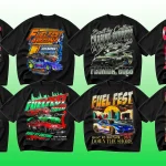
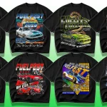
Think about the last time a sports jersey, an esports logo, or a fitness brand identity gave you goosebumps. Before you even processed the team name or the event poster’s headline, something had already convinced you that this was going to be epic. Nine times out of ten, that secret weapon was typography. A chunky, aggressive sans on a football helmet, a razor-sharp condensed face on a Formula 1 billboard, or a perfectly worn varsity script on a basketball warm‑up tee—these premium sports fonts don’t just spell words; they telegraph energy, tradition, and sheer will.
I’ve been a brand designer for over a decade, and my font folder is basically a graveyard of free downloads that looked promising at 2 a.m. but fell apart the moment I opened them in a real project. The turning point came when a client—a grassroots rugby club with dreams of going pro—handed me a logo built from a generic display font. It felt like a Sunday league team, not a future champion. I swapped their typography for a carefully chosen premium sports font, and the entire identity snapped into focus: the jerseys suddenly had presence, the social graphics looked faster, and the merch sales doubled that season. That was the moment I stopped treating type as an afterthought and started investing in it like a core piece of equipment.
If you’re a graphic designer, a brand manager, or a content creator working in the athletic space, the right font family is as crucial as the right color palette. In this post, I’m going to walk you through 20 premium sports fonts that are worth every single dollar. We’ll look at what makes a typeface truly premium, explore a detailed comparison table, and then dive deep into five distinct style categories—from raw power and vintage varsity to hyper‑modern esports tech. Along the way I’ll share personal field notes and point you toward the exact foundry links so you can add these workhorses to your toolkit.
Why Premium Sports Fonts Are a Game‑Changer
Typography has a measurable impact on brand perception. Research from Nielsen Norman Group shows that typeface selection directly influences how users judge credibility, personality, and even the competence of an organization (The Impact of Typeface on Brand Perception). In the sports world, where a split‑second glance at a jersey or an app icon has to convey a whole story, that influence is amplified. A recent article on Creative Bloq examined how sports typography is moving away from generic capitals and toward custom, personality‑packed letterforms (How Typography is Giving Sports Branding a Bold New Look), and the appetite for premium sports fonts has never been higher.
The truth is, free fonts rarely survive the stress tests of a real sports project. They might lack the full set of weights you need for a responsive website, contain poorly drawn numerals that look clumsy on a scoreboard, or—worst of all—come with licensing terms that don’t cover merchandise sales. Investing in a professional typeface eliminates these risks, gives you extensive language support, and often unlocks OpenType features like automatic fractions, alternate characters, and true small caps that make your work look impeccably polished.
If you’re building a resource library, you might also want to explore our growing collection of design assets at Nix Glow Studio, where we regularly share graphic bundles that pair beautifully with the fonts we’re about to cover.
What Makes a Sports Font “Premium”?
Before we jump into the list, let’s define what separates a budget font from a true premium investment.
- License that works: A premium font comes with a commercial license that explicitly permits logo use, merchandise, broadcast, and app embedding—no guesswork.
- Comprehensive family: Instead of a single weight, you typically get multiple widths and weights (Light through Black, plus italics), giving you typographic hierarchy for posters, web, and print.
- Crafted details: Hand‑adjusted kerning, optically balanced curves, and unique stylistic alternates that make a letter “M” look like it belongs on a championship ring.
- Reliable support & updates: Foundries continuously update their premium libraries, fixing technical bugs and adding glyphs.
When you pay for a premium sports font, you are paying for thousands of hours of a type designer’s expertise. And when the final product lands, you can feel that craftsmanship.
20 Premium Sports Fonts Worth Every Designer’s Investment: At a Glance
Below is a quick‑reference table of all 20 typefaces, broken down by category, key trait, approximate starting price, and the ideal playing field for each one.
| Font Name | Category | Key Trait | Starting Price | Best For |
|---|---|---|---|---|
| Industry | Power Player | Ultra‑bold industrial with true italics | $40 | Jerseys, action posters |
| Tungsten | Power Player | Compact, sturdy, and unapologetically strong | $199 | Broadcast graphics, team branding |
| Knockout | Power Player | Full‑family system with historic boxing feel | $199 | Headlines, apparel |
| Bison | Power Player | Heavy, modern geometric sans | $30 | Gym brands, speed‑style logos |
| United | Vintage Varsity | Handcrafted collegiate charm with multiple widths | $49 per style | Throwback uniforms, brewery collabs |
| Freshman | Vintage Varsity | Roughed‑up, authentic college serif | $39 | Campus sports, retro posters |
| Winner | Vintage Varsity | Classic sports script with 10 alternates | $16 | Baseball caps, softball merch |
| Champion | Vintage Varsity | Bold shadowed sans with vintage boxing soul | $25 | Championship events, fitness brands |
| Druk | Speed & Motion | Aggressive ultra‑condensed workhorse | $65 per style | Racing, basketball, editorial |
| PF Din Text Pro | Speed & Motion | Modernized DIN with flawless legibility | $89 | Motorsport dashboards, kit numbers |
| Gin | Speed & Motion | Sharp, precise condensed with tech edge | $45 | Esports racing, automotive |
| Integral CF | Speed & Motion | Bold, dynamic shapes with heavy impact | $30 | Action sports, YouTube thumbnails |
| Greycliff CF | Tech & Esports | Clean geometric sans with seven weights | $30 | Gaming overlays, futuristic logos |
| MADE Outer Sans | Tech & Esports | Wide, confident capitals with alternate glyphs | $25 | Esports jerseys, sci‑fi branding |
| Modeka | Tech & Esports | Sleek techno‑geometric with subtle personality | $17 | Stream overlays, tech‑forward sports |
| Visby CF | Tech & Esports | Friendly geometric with sharp, rounded hybrids | $24 | Fitness apps, inclusive sports brands |
| Gagalin | Display & Decorative | Calligraphic sports script with raw energy | $49 | Boxing posters, lifestyle apparel |
| Strike | Display & Decorative | Quick brush script built for sports | $12 | T‑shirt graphics, social media |
| Tusker Grotesk | Display & Decorative | Punishingly heavy upper‑lowercase grotesque | $20 | Bold headlines, oversized prints |
| Block Berthold | Display & Decorative | Classic heavy slab, the original power font | $49 | Institutional sports, commemorative jerseys |
Now let’s unpack each category so you can see exactly why these premium sports fonts belong in your collection.
1. Power Players: Bold Sans‑Serifs That Command Attention
When you need to scream “unstoppable,” a heavy sans‑serif is your first draft pick. These fonts are built wide, sturdy, and loud—perfect for jerseys, stadium signage, and anything that needs to hit like a tackle.
Industry
Fort Foundry – from $40
View on Fort Foundry
Industry is the definition of a workhorse. I first used it for a fitness festival poster, and the combination of its raw, mechanical skeleton with its true‑italic cuts gave me the exact “industrial grit meets athletic precision” vibe I needed. It comes in multiple weights plus an Incised variant that mimics the look of embroidery on a baseball cap. If I could only keep three sports fonts in my toolbox, Industry would be one.
Tungsten
Hoefler&Co – from $199 for 8 styles
View on Hoefler&Co
If you have ever watched ESPN, a pro basketball game, or an MLB broadcast, you’ve seen Tungsten’s compact, muscular letterforms in action. Its narrow footprint lets you stack big headlines in tight spaces without losing punch. I’ve seen design agencies pair Tungsten’s Medium weight with a delicate serif body copy to create a “strong but sophisticated” sports book layout. It’s a premium investment, but one that immediately elevates any scoreboard or player intro graphic.
Knockout
Hoefler&Co – from $199
View on Hoefler&Co
Knockout is a full typographic system inspired by 19th‑century boxing broadsides. The family contains 32 styles grouped by width, so you can create incredibly nuanced hierarchies while keeping a unified voice. I once designed a vintage fight‑night poster using Knockout No. 92 Flyweight for the undercard and No. 50 Welterweight for the main event—the contrast was cinematic. If your sports branding needs to reference heritage without feeling dusty, Knockout is unbeatable.
Bison
Elianto – from $30 on YouWorkForThem
View on YouWorkForThem
Bison is a relative newcomer that balances brutalism with finesse. Its tall x‑height and tight spacing make it feel aggressive, yet its slightly rounded inner corners keep it modern. I’ve used Bison for a snowboard brand’s logo lockup, and it held its own against high‑contrast photo backgrounds without losing legibility. At $30, it’s an absolute steal for a premium sports font that can go toe‑to‑toe with much pricier families.
2. Vintage Varsity: Retro College Styles for Nostalgic Punch
The crack of a bat, the smell of a leather mitt, the faded glory of a college pennant—retro typography bottles that nostalgia and pours it straight onto apparel, breweries, and lifestyle brands. These premium sports fonts channel the letterman jacket era with authenticity.
United
House Industries – from $49 per style
View on House Industries
United is the benchmark for classic college type. Its condensed, regular, and extended widths let you design an entire uniform package from player names to headline numbers while keeping a consistent spirit. I’ve used United Sans Condensed for a high school football team’s social media rebrand, and the parents said it “looked exactly like a college gameday graphic.” That’s the power of a typeface that understands its own history.
Freshman
Latinotype – $39
View on MyFonts
Freshman adds just the right amount of distress to the traditional varsity serif. Its rough edges and subtle texture make it feel like a screen‑printed shirt that has been washed a hundred times. I turned to Freshman for a craft beer collaboration with a local rugby club; the font’s slightly irregular baseline gave the label an artisanal, small‑batch feel that a perfectly clean vector could never achieve.
Winner
NREY – $16 on Creative Market
View on Creative Market
Winner is a lively sports script loaded with swashes, alternates, and ligatures. Ten alternate characters mean you can customize team names to avoid repetitive letterforms. I used Winner for a junior baseball cap design, and the flowing script tail under the brim gave it an instant “dad hat” cool factor. At $16, it’s one of the most affordable premium sports fonts that still delivers a hand‑lettered feel.
Champion
HVD Fonts – $25
View on MyFonts
Champion is a multi‑weight family built around a central shadowed style that recalls vintage boxing posters and heavyweight title fights. The font ships with a Shadow, Inline, and clean sans version, so you can layer them for three‑dimensional effects without leaving the family. I once built an entire local boxing tournament identity exclusively with Champion—posters, tickets, and even the canvas logo—and the consistency was magnetic.
3. Speed & Motion: Italics and Obliques for Dynamic Energy
Great sports fonts don’t sit still. The typefaces in this category feel like they’re already in motion, making them indispensable for racing, extreme sports, and any brand that wants to communicate velocity.
Druk
Commercial Type – from $65 per style
View on Commercial Type
Druk is the heavy‑hitter of condensed fonts. Its letterforms are squeezed into an impossibly tight width without sacrificing readability. I’ve seen Druk used for a Red Bull‑style action sports campaign, and its sheer density made the headlines feel like a physical force. If you need a font that looks like it could outrun you, Druk is it.
PF Din Text Pro
Parachute Typefoundry – $89
View on Parachute
DIN is the grandfather of modern sports typography, originally designed for German road signage and later adopted by motorsports, football kits, and tech companies. PF Din Text Pro modernizes the classic proportions, adding optical corrections and a full Greek/Cyrillic character set. Whenever I design for a racing team or a timing app, this is the font I reach for because its numerals are among the clearest in the game.
Gin
Fort Foundry – $45
View on Fort Foundry
Gin is like the precision instrument of the group—sharp, upright, and slightly mechanical. I think of it as the typographic equivalent of a carbon‑fiber bike frame. It works exceptionally well in esports motorsport visuals and automotive branding, but I once also used it for a triathlon event’s wayfinding signage, and the sharp terminals remained legible even under harsh sun.
Integral CF
Connary Fagen – $30
View on Connary Fagen
Integral CF combines geometric shapes with exaggerated ink traps and a brawny silhouette. It feels modern but also physical, like a fitness influencer’s logo. I’ve dropped Integral CF into YouTube thumbnail designs for a sports channel, and the bold shapes stayed crisp even when compressed by the platform. The family includes six weights plus obliques, which is rare at this price point.
4. Tech & Esports: Futuristic Fonts for the Digital Arena
Esports and sports tech demand typography that reads well on screens, animates smoothly, and looks firmly rooted in the future. These premium sports fonts are built for streaming overlays, tournament brackets, and sci‑fi‑tinged athletic brands.
Greycliff CF
Connary Fagen – $30
View on Connary Fagen
Greycliff CF is a clean, slightly squared geometric sans that walks the line between friendly and technical. I’ve used it for a fitness app UI, and its seven weights—from Thin to Heavy—made it easy to build a clear information hierarchy. It also has a Cyrillic set, which has saved me more than once on international projects. For a premium sports font that plays well in both app interfaces and stadium jumbotrons, Greycliff is a sleeper hit.
MADE Outer Sans
MadeType – $25
View on Creative Market
With its wide proportions and distinctive alternate uppercase letters, MADE Outer Sans immediately says “futuristic team logo.” I used it for a regional esports league’s jersey mockup, and the high contrast alternates (think stylized “A” and “M”) gave each player’s gamertag a bespoke look without the cost of a custom logotype. It’s a premium typeface that feels custom right out of the box.
Modeka
Gumpita – $17
View on Creative Market
Modeka blends geometric construction with subtly angled terminals, resulting in a font that’s both futuristic and approachable. I love it for stream scene design—its uppercase letters have a “glitch‑adjacent” personality that pairs beautifully with neon gradients and animated backgrounds. At just $17, it’s one of the most budget‑friendly premium sports fonts in the tech category.
Visby CF
Connary Fagen – $24
View on Connary Fagen
Visby CF is the friendly face of the esports world. Its geometric foundation is softened by rounded outer corners (which you can dial up or down via stylistic sets), making it brilliant for inclusive sports campaigns, youth leagues, and wellness brands. I once built a girls’ coding‑and‑sport camp identity around Visby CF, and its warmth balanced the tech‑heavy curriculum perfectly.
5. Display & Decorative: Unique Identity for Standout Branding
Sometimes you need a typeface that refuses to be a background player. These display fonts are the showstoppers—perfect for hero logos, limited‑edition merchandise drops, and statement posters.
Gagalin
Resistenza – $49
View on MyFonts
Gagalin is a calligraphic sports script that feels like it was painted with a flat brush in a gritty gym. Its energetic swashes and texture options (Rough, Stamp, Clean) make it a monster for boxing events, lifestyle brand mark, and music‑sports crossovers. I used Gagalin for a MMA fighter’s walkout hoodie, and the distressed version looked so authentic that fans asked where they could buy it before the fight even started.
Strike
Epiclinez – $12
View on Creative Market
Strike is proof that you don’t need to spend a fortune to get a premium‑level sports script. It’s a fast, gritty brush font loaded with stylistic alternates and ligatures that mimic spontaneous hand‑lettering. I reach for Strike when I need a “quick win” for social graphics—baseball announcements, draft day reveals, MVP shout‑outs. In five minutes, I can build a graphic that looks like a custom piece of sports merch.
Tusker Grotesk
Lewis McGuffie – $20
View on YouWorkForThem
If Bison is a sledgehammer, Tusker Grotesk is a wrecking ball. Its absurdly heavy weights—especially the 8600 Black—create a visual weight that demands attention. I’ve used it for stadium banners and oversized event signage where the text had to be visible from 200 meters away. It’s an upper‑lowercase family, which makes it more versatile than many all‑caps power fonts.
Block Berthold
Berthold – from $49
View on Berthold
Block Berthold is the original heavy slab that has been a cornerstone of institutional sports aesthetics for decades. It’s the typeface you see on classic football jerseys, university athletics departments, and vintage Olympic posters. I’ve paired Block Berthold with a delicate body serif to create a “legacy meets luxury” editorial layout for a sports history magazine, and the result felt instantly authoritative.
How to Choose the Right Premium Sports Font for Your Project
With 20 powerful options, picking the right one can feel overwhelming. Here’s a quick mental checklist I use:
- What’s the energy? Aggressive = go with heavy sans (Industry, Bison). Nostalgic = varsity (United, Freshman). Futuristic = tech geometrics (Greycliff CF, MADE Outer Sans).
- Where will it live? Broadcast graphics demand crisp condensed faces like Tungsten; apparel thrives with scripts like Winner or Gagalin; user interfaces love clean workhorses like Visby CF.
- Do you need numerals? Scoreboards and stats heavy pages require fonts with best‑in‑class figures—Tungsten, PF Din Text Pro, and Knockout excel here.
- What’s the license requirement? Always check the EULA. A “desktop only” license may not cover your merchandise; if in doubt, reach out to the foundry.
I strongly recommend building a core collection of three to four premium sports fonts from different categories. That small investment gives you the flexibility to tackle jerseys, social media, event signage, and broadcast graphics without ever looking generic.
Conclusion: Make the Investment Your Work Deserves
Every designer remembers the first time they saw their work on a jersey or a stadium screen. That moment is the culmination of hundreds of tiny decisions, and typography is the one that speaks the loudest. Free fonts may temporarily fill a gap, but they rarely capture the nuance, spirit, and legal safety that premium sports fonts deliver. The 20 typefaces above—from the bulletproof Tungsten to the brush‑fueled Strike—represent thousands of hours of expert craftsmanship, and they’re priced to be accessible whether you’re a freelance designer or part of a huge agency.
When I look back at that rugby club rebrand, I realize the £40 I spent on Industry was the best line item in the entire project budget. It didn’t just change how the club looked; it changed how they felt about themselves. And that’s the real return on investing in professional typography.
Ready to level up your sports design toolkit?
Start by grabbing one or two fonts from this list that match your next project’s energy, and watch the difference they make. While you’re building that perfect type library, don’t forget to check out the high‑quality design bundles and resources over at Nix Glow Studio—we’re always adding assets that pair seamlessly with premium typefaces.
If you want to see real‑world applications, motion demos, and behind‑the‑scenes of how we use these fonts, subscribe to our YouTube channel (Nix Glow Studio on YouTube) and follow our daily inspiration feed on Instagram (@nixglowstudio).
Now go make something that feels like a champion.
Related Posts
- Custom Bootleg Rap T-Shirt Design 90s Vintage Style

- Custom Bootleg Rap T-Shirt Design Service | 90s Vintage Style | Photoshop Expert
- I will design a vintage bootleg rap t-shirt with 90s hip hop streetwear style

- I will design a custom vintage 90s bootleg rap t shirt
- I will design a premium bootleg rap t-shirt with vintage hip hop aesthetic
- I will create custom 90s vintage bootleg rap and sports t shirt design

Learn, Create, Inspire
Thank you for visiting NixGlow Studio. Explore more resources and connect with our creative community.
- 🏠 Home Page: https://nixglowstudio.com/
- 👤 About Page: https://nixglowstudio.com/about/
- 🎨 Services Page: https://nixglowstudio.com/services/
- 🖼️ Portfolio Gallery: https://nixglowstudio.com/portfolio/
- 📚 Resources Center: https://nixglowstudio.com/resources/
- 📝 Blog Library: https://nixglowstudio.com/blog/
- 📞 Contact Page: https://nixglowstudio.com/contact/
Social Media Links
▶️ YouTube: https://www.youtube.com/@nixglowstudio
📸 Instagram: https://www.instagram.com/nixglowstudio/
Keep learning and growing with NixGlow Studio.