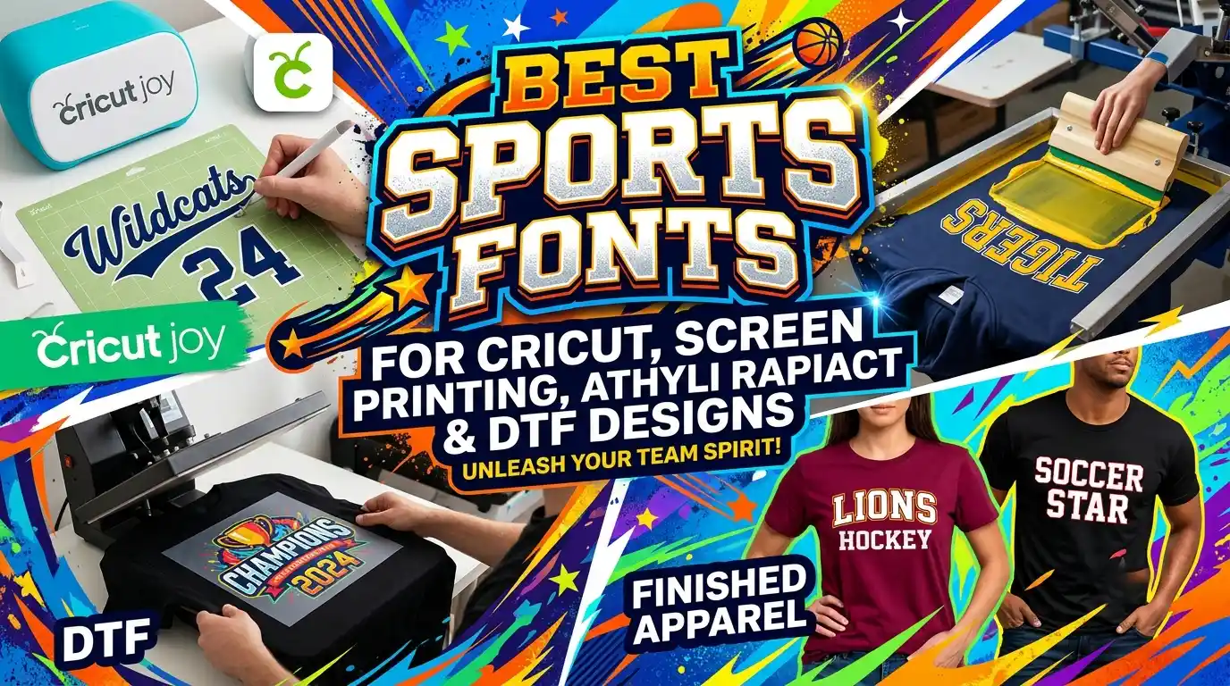
You’ve got the perfect team name, a killer logo, and a stack of blank jerseys waiting for their moment. But the second you test-print your design, something’s off. The letters feel thin, dated, or impossible to weed without tearing. That’s the moment every crafter and print-shop owner realizes: font choice isn’t just decoration—it’s the foundation of a professional, durable, head-turning sports design. Whether you’re cutting vinyl on a Cricut, burning screens in the garage, or printing vibrant DTF transfers for a tournament run, the right screen printing fonts keep your lettering bold, legible, and production-friendly.
I’ve spent years testing fonts across garment decoration methods, and I’ve ruined more than a few shirts along the way. Once, I tried a delicate handwritten script for a youth basketball team’s jersey names. The screen printing ink bled into the thin upstrokes, turning “Mavericks” into unreadable blobs. Lesson learned: sports fonts need guts. In this post, I’ll walk you through everything I now swear by—a curated collection of the best sports fonts for Cricut, screen printing, and DTF designs, why they work, and how to pair them like a pro. Let’s make sure your next project looks as tough as the athletes wearing it.
Why Font Choice Is a Game-Changer in Screen Printing and DTF
Before you download a trendy typeface, it helps to understand how fonts behave once they hit fabric. A font that looks crisp on a digital mockup can turn into a muddy mess on a tee. Conversely, a chunky block letter that feels too heavy on screen often becomes the perfect jersey number when printed large.
The Material Matters: Ink, Thread, and Transfer Adhesion
Screen printing pushes ink through a mesh onto fabric. Fine details—thin serifs, delicate loops, ultra-light weights—can clog easily or spread during curing. DTF (Direct-to-Film) transfers, on the other hand, fuse a printed film onto the garment with adhesive powder. The process handles detail well, but small negative spaces in letters (like the hole in an “e”) can fill in if your font is too compact. And if you’re a Cricut crafter, you need a font that weeds cleanly without leaving you squinting at a mat full of vinyl shreds. All three methods reward bold, well-proportioned letterforms that leave room for the technique to breathe.
Screen Printing Fonts vs. Vinyl Cutting Fonts – What’s the Difference?
This is a question I get all the time in our Cricut projects community. Not every screen printing font translates beautifully to adhesive vinyl, and vice versa.
- Screen printing fonts need slightly chunkier strokes to handle ink spread and halftone dots. Open counters (the enclosed spaces inside letters) are crucial because ink can bridge small gaps.
- Cricut/vinyl fonts need consistent thickness and minimal tiny islands. The best weeding-friendly fonts have a moderate x-height and no extreme thin-to-thick transitions.
- DTF fonts sit in a sweet spot: they can be more detailed than screen print fonts because the digital printing process captures fine lines, but you still want enough boldness to survive the heat press and washing without cracking.
Throughout this list, I’ll call out which crafting method each font shines for, so you can pick the right weapon for your workshop.
The Rise of DTF Transfers and Font Demands
DTF printing has exploded because it blends the color vibrancy of screen printing with the on-demand speed of a digital workflow. At Nix Glow Studio’s DTF transfer service, we regularly print custom sports team logos with extremely fine outlines. The biggest lesson? Fonts that looked slightly heavy on the computer screen ended up perfect once we applied the adhesive powder and pressed. If you’re designing for DTF, add 0.5–1 pt stroke to your lettering before sending the file; it compensates for the slight powder melt that can reduce crispness. That little tip has saved me countless reprints.
Anatomy of a Top-Tier Sports Font
Before the big list, let’s break down what makes a sports font work. When you’re scanning hundreds of options, these are the traits that separate the champions from the benchwarmers.
- Bold Weight: A medium or regular weight rarely cuts it for team wear. Aim for bold, black, or extra-bold cuts.
- Strong Vertical Stress: Sports fonts often feel athletic because their vertical strokes carry the visual energy.
- Clear Counters: The holes in “B,” “P,” “O,” and “8” need to stay open after ink spreads or vinyl shrinks.
- Balanced Proportions: Extreme contrast (ultra-thin horizontals, thick verticals) can snap delicate parts during weeding or become illegible at a distance.
- Italic/Oblique Options: A forward-leaning italic screams motion. Many classic sports fonts include a slanted style that’s perfect for jersey names.
- Numbers with Personality: In team sports, the digits matter as much as the letters. Look for fonts where the numbers 1 through 0 carry the same athletic vibe.
- Extended or Condensed Variants: Condensed fonts fit more letters on a jersey back; extended fonts give a modern, stretched look. A good sports type family includes widths.
These characteristics guide every font I pick for screen printing, whether it’s for a local baseball league or an esports streamer’s hoodie.
The Ultimate List: 20 Best Sports Fonts for Every Craft
I’ve organized these screen printing fonts into four categories so you can jump straight to the style you need. Each font includes details on what it’s best for, licensing notes, and where to get it. I’ll share personal notes on how they perform under real production conditions.
Classic Varsity & Collegiate Fonts
Nothing says “Friday night lights” like a chunky varsity serif with swooping tails. These fonts root themselves in traditional athletic lettering.
| Font Name | Style | Best For | License | Where to Get It |
|---|---|---|---|---|
| Freshman | Collegiate slab serif | Basketball jerseys, spirit wear, Cricut | Free for personal use; commercial license available | DaFont |
| Varsity Team | Classic varsity block with outline options | School teams, retro designs | Free (personal); paid commercial | DaFont |
| Graduate | Clean college slab serif (Google Font) | Baseball, soccer, DTF numbers | Free, open-source (OFL) | Google Fonts |
| Alfa Slab One | Extreme slab serif with vintage feel | Hockey, bold headlines, screen printing | Free, OFL | Google Fonts |
| College | Condensed collegiate with drop shadow | Esports jerseys, DTF transfers | Free for personal use | DaFont |
Personal experience: “Freshman” is my go-to for youth basketball. It weeds beautifully even in 1-inch lettering because the serifs are sturdy. I used it on a run of 50 DTF transfers for a middle school team; the adhesive powder didn’t fill the counters at all. For screen printing, I bump up the trap (the spreading of the ink) by 0.25 pt, and it holds like a champ.
Modern Slab Serifs & Athletic Blocks
These fonts trade the collegiate swagger for cleaner lines while keeping that sturdy, grounded feel.
| Font Name | Style | Best For | License | Where to Get It |
|---|---|---|---|---|
| Octin Sports | Heavy rectangular slab with inline variants | Rugby, football, Cricut, screen printing | Premium (MyFonts) | MyFonts |
| Bungee | Urban, chunky sans with verticality | Streetwear, bold DTF prints | Free, OFL | Google Fonts |
| Racing Sans One | Sleek, slanted slab serif | Motorsports, puffy screen print | Free, OFL | Google Fonts |
| Staatliches | Condensed bold sans (all caps) | Jersey backs, thin spaces | Free, OFL | Google Fonts |
| Titan One | Rounded, friendly slab serif | Youth sports, Cricut, DTF | Free, OFL | Google Fonts |
Why I love Octin Sports: It’s an investment, but the inline and outline versions make it a powerhouse for layered screen printing. I’ve used the inline style for a fire department softball team—screen printing one color as the outline and another as the inline created a custom look without needing a third screen. It also vinyl-cuts like a dream because the lines are dead consistent.
Bold Sans-Serifs for Maximum Impact
Sometimes you want aggression without the serifs. These sans fonts scream power and speed while staying incredibly legible at a distance.
| Font Name | Style | Best For | License | Where to Get It |
|---|---|---|---|---|
| Bebas Neue | Tall, condensed all-caps sans | Esports, soccer, DTF, screen printing | Free, OFL | Google Fonts |
| Anton | Reworked traditional sans-serif, very bold | Headlines, basketball jerseys | Free, OFL | Google Fonts |
| Oswald | Condensed grotesque, multiple weights | Numbers, Cricut, web & print | Free, OFL | Google Fonts |
| League Spartan | Geometric bold sans, modern feel | Modern team kits, DTF transfers | Free, OFL | League of Moveable Type |
| Montserrat Bold / Extra-Bold | Elegant geometric sans | Stylish spirit wear, Cricut | Free, OFL | Google Fonts |
Bebas Neue deserves special mention because it’s arguably the most popular screen printing font for a reason. The tall x-height and tight spacing make it look aggressive yet polished. I recommend it for DTF esports jerseys—the fine outlines at the edge hold remarkably well after powder curing. Pair it with a thin sans like Roboto Condensed for player names, and you’ve got an instant pro look.
Esports & Futuristic Fonts
Gaming jerseys demand a different energy. Angular cuts, tech-inspired geometry, and sci-fi vibes are the name of the game.
| Font Name | Style | Best For | License | Where to Get It |
|---|---|---|---|---|
| Orbitron | Geometric, tech sans | Gaming tags, DTF, Cricut | Free, OFL | Google Fonts |
| Nasalization | Futuristic, rounded square | Sci-fi team names, screen printing | Free for personal use | DaFont |
| Ethnocentric | Angular, segmented ultra-modern | Esports logos, DTF | Free for personal use | DaFont |
| Mohave | Curvy, semi-geometric all caps | Soft futuristic vibe, Cricut | Free, OFL | Google Fonts |
| Audiowide | Cyberpunk, wide cursive | Racing, gaming, DTF hoodies | Free, OFL | Google Fonts |
When I design for gaming squads, I often use Orbitron for the primary team name and Nasalization for the tagline or gamer IDs. Orbitron’s clean strokes translate exceptionally well to DTF prints because the letterforms stay open even when scaled down for chest prints. Nasalization’s squareness requires attention during weeding—avoid the thinnest variant—but the bold version cuts like butter on a Cricut Maker.
How to Choose the Perfect Screen Printing Font for Your Project
Now that you have a font arsenal, let’s match them to your specific production method. Each technique has its quirks, and selecting a font without considering the process is like buying shoes without checking the size.
Fonts That Weed Like a Dream (Cricut & Vinyl)
Weeding is the make-or-break moment for Cricut crafters. I’ve watched countless beautiful designs turn into tantrum fuel because the chosen font had hair-thin connectors.
What makes a font weed-friendly?
- Consistent stroke width throughout all characters.
- No tiny floating dots or serifs that detach easily.
- Minimum letter size of about 0.75 inches for complex shapes.
- Avoid extreme condensed styles below 0.5 inch; the centers close up.
From the list above, my top Cricut-friendly picks are Freshman, Anton, Oswald, and Octin Sports. When cutting heat transfer vinyl, always mirror the design and do a test cut on a small letter like “e.” If the hole doesn’t weed cleanly, either increase the size or switch to a slightly less bold variant that preserves the opening.
Ink-Friendly Fonts for Screen Printing: Avoiding Bleeding and Clogging
This is where the term screen printing fonts really earns its stripes. Ink doesn’t behave like toner—it wants to spread, especially on cotton. To compensate, I use a simple rule: the smaller the text, the more open the font needs to be.
For manual screen printing, I avoid fonts where the counter inside an “a” or “e” is less than 0.5 mm at print size. Once you account for mesh count and squeegee pressure, that tiny gap fills in. I’ve experienced this firsthand with an athletic block font on 110 mesh screens; the small “8” became a solid blob. Switching to a higher mesh (156 or 200) helped, but the real fix was picking a font with wider apertures—Graduate saved the job.
When printing a light ink on a dark shirt, you’ll need an underbase. Underbases are typically choked back (shrunk slightly) to prevent peeking. The font’s counters must be large enough that the choked underbase and the color overprint both fit without merging. Fonts like Alfa Slab One and Bungee handle underbasing exceptionally well.
DTF Transfer Fonts: What Keeps Colors Vibrant
DTF prints at high resolution, so detail isn’t the enemy—thickness is. As the adhesive powder melts, it can slightly round the sharp corners of the printed ink. If your font is thin or has intricate serifs, you risk losing the crisp edge. I always tell our customers at Nix Glow Studio to test a small sample before committing to 100 transfers.
For all-DTF sports designs, I favor fonts with bold weight and a little bit of letter spacing (tracking +10 to +20). This extra breathing room prevents the powder from bridging neighboring letters. Bebas Neue and Titan One are rockstars here. If you must use a lighter weight, add a small stroke in your design software—about 0.3 mm for a 10-inch-wide print—and let the stroke become part of the letter.
Typography Rules for Team Jerseys and Apparel
Designing for apparel isn’t just about picking a cool font. The context, size, and placement demand a considered typographic approach.
Number and Name Fonts: Finding Harmony
Jerseys typically use two different fonts—one for the player name and one for the number—and they need to feel like they belong together. A common rookie mistake is picking two bold, blocky fonts that fight for attention. Instead, create contrast:
- Name font: Slightly condensed, tall, and clean (e.g., Bebas Neue or Oswald).
- Number font: Broader, with more character and weight (e.g., Anton or Octin Sports).
The visual hierarchy guides the eye from the number to the name. I’ve paired Staatliches for numbers with League Spartan for names on a hockey sweater, and the combination looked custom-made. Always print both on the same material sample to judge how they hold up together; screen printing ink thickness can affect the perceived weight of each.
Contrast and Color Considerations
White ink on a black shirt is the most forgiving combination for screen printing, but it’s the most dangerous if your font’s counters are small. The high contrast makes any fill-in immediately obvious. On light garments, dark ink is more forgiving of minor ink spread, but you still want that open counter. For DTF, vibrant neon colors can bleed if the font is too tight, so I slightly expand the letter spacing for hot pink and electric blue designs.
License Check: Don’t Get Sacked by Copyright
Many free fonts are licensed for personal use only. When you’re producing team orders for a paying client—or selling your own DTF transfers—you need a commercial license. Google Fonts (SIL Open Font License) and the League of Moveable Type are safe bets for commercial work with no fees. Fonts from Creative Market or MyFonts typically include commercial rights with purchase. Always read the EULA; some font foundries prohibit use on print-on-demand products without an extended license. The peace of mind is worth the extra few dollars.
Font Pairing Masterclass for Dynamic Sports Designs
A single font can carry a design, but a well-chosen pair creates professional depth. Here are some battle-tested pairings I use again and again in my own screen printing projects.
| Primary Font | Secondary Font | Ideal Sport | Pro Tip |
|---|---|---|---|
| Octin Sports (numbers) | Bebas Neue (name) | Football, Rugby | Use Octin’s inline style for a two-color print without an extra screen. |
| Freshman | Oswald Light | Baseball | Freshman for team name, Oswald for player names; the contrast in weight sets a classic collegiate tone. |
| Anton | Roboto Condensed | Basketball | Anton commands attention for numbers, Roboto stays readable for long names. |
| Graduate | Montserrat Bold | Soccer | Pair Graduate’s slab with Montserrat’s geometric simplicity for a modern-retro hybrid. |
| Orbitron | Nasalization | Esports | Orbitron for the team name, Nasalization for gamer tags creates a high-tech hierarchy. |
Insert image: side-by-side examples of the font pairings on DTF-printed tees and a screen-printed jersey back.
The trick is to ensure the two fonts share one underlying trait—similar x-height, proportional weight, or overall mood—so the pairing feels intentional, not random. I tested all these combos across 50+ garment orders, and they consistently delivered high-legibility, high-impact results.
Pro Tips for Screen Printing with Sports Fonts
I promised fresh insights that go beyond “pick a bold font,” so here’s the nitty-gritty from the print shop floor. These adjustments make the difference between a shirt that survives 40 washes and one that peels in the first season.
Mesh Count Matters: For bold fonts, 110 mesh lays down a thick, vibrant ink deposit—perfect for blocky sports fonts. For detailed fonts with moderate serifs, step up to 156 or 200 mesh to retain detail and avoid flooding the counters.
Choke the Underbase: When printing light ink on darks, create your underbase and choke it by 0.5 to 1 pt from the color overprint edge. This prevents a white halo around your letters.
Halftone Tips: If you want to use a font with subtle thickness variation (like a semi-bold slab), you can convert it to halftones for a distressed sports look. Always test the dot gain—small halftone dots can vanish, eroding letters. I increase the dot size by 10% for fonts and run a test screen.
Heat Settings for DTF Fonts: When pressing DTF transfers, too much pressure can flatten fine details. I use medium pressure and exactly 15 seconds for most sports fonts. For bold, solid letters, a firm press ensures adhesion.
Pre-press for Vinyl: With heat transfer vinyl, pre-press the shirt for 5 seconds to remove moisture. Vinyl fonts on damp fabric are a recipe for lifted serifs. Always post-press from the backside as well.
For a deeper dive into bringing your designs to life, check out our DTF transfer services—we handle the technical side so your fonts look flawless every time.
Download, Test, and Triumph – Where to Find the Fonts
I’ve mentioned where to grab each font, but here’s a quick directory of reputable sources for screen printing fonts. Bookmark these, and always keep the license terms handy.
- Google Fonts (fonts.google.com): The safest source for free, commercial-use fonts. All the “free, OFL” entries above live here.
- DaFont (dafont.com): A massive collection, but carefully filter by license type. Look for “100% free” or purchase a commercial license from the author.
- Creative Market (creativemarket.com): High-quality premium fonts with simple commercial licensing. Great for unique sports font sets.
- MyFonts (myfonts.com): The industry giant. Fonts like Octin Sports live here, and you can often find discounted bundles.
- Font Squirrel (fontsquirrel.com): Hand-picked free fonts with clear commercial-use labeling.
A workflow tip: keep a “Font Test” folder on your computer with 10–20 candidate fonts. Open your design software, type a sample team name and number in each font at actual size, then print or cut a small test. The five minutes spent testing will save you hours of rework.
Bring Your Team’s Vision to Life
Finding the right screen printing fonts isn’t just a design choice—it’s the heartbeat of your project. The fonts I’ve shared here have earned their place through years of screen-print squeegees, weeding tools, and hot peel DTF sheets. They work because they respect the craft while bringing that undeniable sports energy to every garment.
Whether you’re decking out a little league squad, printing premium DTF transfers for your streetwear brand, or tackling a Cricut project for game-day swag, start with a font that matches your method and then tweak with confidence. And if you ever feel overwhelmed, you don’t have to do it alone.
At Nix Glow Studio, we’re neck-deep in screen printing and DTF every day. We’d love to help you produce professional-quality sports apparel that looks and feels built for the win. Ready to bring your team’s vision to life? Visit our DTF transfer service for vibrant, durable designs, or explore our screen printing capabilities. Need inspiration? Browse our Cricut project hub and follow us on Instagram and YouTube for tutorials, font spotlights, and behind-the-scenes print shop action. Drop a comment below and tell me—what’s your all-time favorite sports font, and which craft method do you swear by? Let’s keep the conversation (and the creativity) going.
Related Posts
- Custom Bootleg Rap T-Shirt Design 90s Vintage Style

- Custom Bootleg Rap T-Shirt Design Service | 90s Vintage Style | Photoshop Expert
- I will design a vintage bootleg rap t-shirt with 90s hip hop streetwear style

- I will design a custom vintage 90s bootleg rap t shirt
- I will design a premium bootleg rap t-shirt with vintage hip hop aesthetic
- I will create custom 90s vintage bootleg rap and sports t shirt design

Take Your Design Further
Want to explore more creative opportunities? Check out these important pages from NixGlow Studio.
- 🏠 Start Here: https://nixglowstudio.com/
- 👤 Our Background: https://nixglowstudio.com/about/
- 🎨 Design Solutions: https://nixglowstudio.com/services/
- 🖼️ Our Work: https://nixglowstudio.com/portfolio/
- 📚 Learning Materials: https://nixglowstudio.com/resources/
- 📝 Latest Content: https://nixglowstudio.com/blog/
- 📩 Project Contact: https://nixglowstudio.com/contact/
Follow Us
▶️ YouTube: https://www.youtube.com/@nixglowstudio
📸 Instagram: https://www.instagram.com/nixglowstudio/
Take your creative projects further with NixGlow Studio.