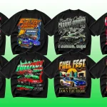
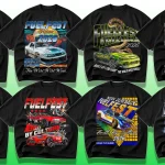
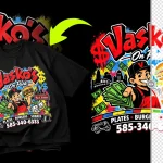
Close your eyes and think of a 1993 Wu-Tang Clan tee, a faded Biggie bootleg from Canal Street, or a cracked A Tribe Called Quest tour shirt. The graphic is fuzzy, the cotton is soft as butter, and the typography hits you before the beat drops. That raw, unpolished lettering isn’t random — it’s a language. The right fonts can turn a blank tee into a time machine, straight back to the golden era of hip-hop.
But here’s the thing: most “vintage font” lists are generic. They give you the same ten options without explaining why a fat, drippy graffiti script feels authentic while a clean modern sans-serif falls flat. In this post, we’re diving deep into the fonts that defined an era, how to choose them, and how to make them look genuinely aged — not like you just downloaded a distressed typeface five minutes ago. Whether you’re a streetwear brand owner, a designer, or a DIY creator, by the end you’ll have the typographic blueprint to design tees that resonate with hip-hop’s visual soul.
The Role of Typography in Hip-Hop Culture
Hip-hop has always been a visual culture as much as a musical one. From the moment graffiti writers tagged subway cars in the Bronx, letterforms became a badge of identity. Crew names, album titles, protest slogans — they weren’t just written, they were drawn with attitude. Typography carried the same energy as a beat: bold, confrontational, and impossible to ignore.
When that aesthetic jumped onto clothing, the fonts did the heavy lifting. A Supreme box logo uses a simple italic serif, but its heavy weight and stark contrast scream street authority. The iconic Run-DMC logo is pure Helvetica compressed into a tight, powerful block. Even today, when you see a distressed Old English font on a tee, your brain immediately links it to West Coast gangsta rap and 90s street fashion.
So the fonts you pick for a vintage hip-hop shirt aren’t just decoration — they’re the first bar of a story. Choose wrong, and the whole design feels like a costume. Choose right, and it feels like a grail piece dug out of a thrift shop crate.
What Makes a Font “Vintage” in Hip-Hop Design?
Before we list the best fonts, let’s break down the visual traits that trigger that nostalgic, worn-in feel. Real vintage hip-hop tees weren’t made to look old — they became old through years of wear, washing, and sun fading. Digitally recreating that requires more than just a distressed font file.
Key characteristics to look for (or add later):
- Ink bleed and misregistration – slightly fuzzy edges that mimic cheap screen printing on thick cotton.
- Rough textures – cracks, grime, and uneven fills that echo a cracked plastisol print.
- Uneven baselines – letters that bounce, tilt, or overlap slightly, as if hand-pulled.
- Bold, heavy weights – most classic hip-hop graphics use extra-bold or black weights to dominate the chest.
- Cultural references – graffiti handstyles, Old English, bubble letters, and collegiate block type all pull from specific hip-hop subcultures.
These traits can come baked into a font, but more often you’ll combine a solid base typeface with manual distressing. We’ll get to that. First, let’s explore the categories of fonts that form the foundation of the look.
Top Font Categories for Vintage Hip-Hop T-Shirt Designs
Graffiti & Handstyle Fonts
If you want instant street credibility, graffiti-inspired fonts are non-negotiable. They replicate the wildstyle tags, throw-ups, and pieces that evolved alongside breakdancing and DJing. The best options feel fluid and slightly irregular, like they were painted with a fat cap on a metal shutter.
What to look for: interconnected letters, exaggerated flourishes, spray-paint splatters, and a natural flow. Avoid overly polished script fonts — hip-hop graffiti is raw, not calligraphic.
Personal experience: I once designed a Big L tribute tee using a “Fat Cap” style font. Straight out of the file it looked too clean. After adding a slight blur to mimic spray over-spray and roughening the outlines with a Photoshop brush, it suddenly felt like a piece pulled straight from a 139th Street wall. That extra step is everything.
Recommended styles: Wildstyle, throw-up bubble letters, marker tags, stencil-spray hybrids.
Bubble & Cartoon Fonts
Bubble letters are deeply embedded in hip-hop history, from Phase 2’s softie style to the chunky, inflatable look of early 90s album art. They read as playful, approachable, and unapologetically fun — perfect for party-rocking crews or feel-good retro designs.
The key with bubble fonts is weight and consistency. The best ones have rounded, almost circular counters and a consistent stroke thickness. They work beautifully for short phrases or nicknames across the chest. Pair them with a high-contrast color like bright pink or electric green on a faded black shirt, and you’ve got instant flavor.
Distressed Serif Fonts
Not all vintage hip-hop typography shouts. Some of the most iconic pieces whisper with authority through worn-in serifs. Think of the classic “90s bootleg” tee — a tight, serif-heavy layout that looks like it was photocopied three times and slapped on a shirt outside a concert venue.
Serif fonts with sharp brackets and high contrast between thick and thin strokes can evoke everything from luxury fashion references (like a knock-off Gucci logo) to that photocopied zine aesthetic. When you distress them — add grain, rips, or halftone patterns — you get a shirt that looks like a discovered artifact from a 1994 tour.
Blackletter & Gothic Fonts
Old English and gothic scripts are inseparable from West Coast gang culture and Chicano lettering traditions, which heavily influenced hip-hop style. N.W.A, Snoop Dogg, and countless other artists cemented the aggressive elegance of blackletter fonts on merch, album covers, and tattoos.
On a tee, blackletter commands respect. It’s intricate, bold, and slightly menacing. For a vintage feel, you’ll want a version with slightly uneven stroke widths and rough terminals. Perfect for last names, crew names, or single impactful words across the back.
Stencil & Military Fonts
The stencil look channels a utilitarian, almost militant vibe — think Public Enemy’s logo or the beret-wearing aesthetic of conscious rap crews. Stencil fonts are broken into pieces with sharp, clean gaps, as if spray-painted through a cardboard cutout. When aged with overspray and bleed, they gain that warehouse-party flyer authenticity.
These work especially well on olive drab, tan, or washed black tees. They also pair nicely with anti-establishment messaging or minimalist layouts where the type itself is the statement.
Retro Sans-Serifs (The Bold Workhorse)
Sometimes you don’t need a decorative font; you just need a heavy, no-nonsense sans-serif that screams block party. Fonts like Helvetica Inserat (extra bold compressed) or a worn Franklin Gothic can anchor a design with pure muscle. Many classic hip-hop logos rely on this category, then add an outline, shadow, or distressed treatment to age it.
Retro sans-serif fonts are the most versatile. They can play the straight man next to a wild graffiti font on the back of the shirt, or stand alone on a front pocket hit with maximum impact.
Western & Southwestern Style Fonts
A surprising but authentic thread in vintage hip-hop fashion is the influence of Western typography. From the rodeo-style lettering on 90s Cross Colours pieces to the serif-saloon fonts used in G-funk era graphics, this crossover speaks to a shared sense of bold, decorative lettering. Use a slab serif with Tuscan-style spurs or a circus-poster typeface, age it heavily, and you’ve got a unique tee that references the Left Coast’s lowrider and funk heritage.
The Best Specific Fonts for Vintage Hip-Hop T-Shirts
Theory is great, but you need names. Below is a curated table of specific fonts (both free and premium) that nail the vintage hip-hop aesthetic. This isn’t a “Top 100” — it’s a tight selection of go-to typefaces I’ve personally used or seen on authentic streetwear pieces.
| Font Name | Category | Vibe / Era | Best For |
|---|---|---|---|
| Fat Frank | Graffiti / Handstyle | 90s tag style, drippy and unrefined | Main chest hit, crew names |
| Streetwear | Bubble / Cartoon | Playful, inflatable, early 90s | Colorful throwbacks, nicknames |
| Bangers | Comic / Bold Script | Energetic, retro comic book feel | Sound effect words (Boom! Pow!) |
| Permanent Marker | Handstyle / Marker | Felt-tip tag style, quick and raw | Back prints, sign-off tags |
| Lulo Clean Bold | Distressed Serif | Photocopied bootleg tee aesthetic | Front logo lockups, artist names |
| Canterbury | Blackletter / Gothic | Old English, classic West Coast | Last name prints, aggressive text |
| Stencil Std | Stencil / Military | Utilitarian, political rap | Bold statements, back designs |
| Komu B | Retro Sans-Serif | Heavy condensed, industrial | Logo lockups, year numbers |
| Bebas Neue (custom distressed) | Clean Sans-Serif | Modern base for aging treatments | Versatile foundation typeface |
| Roper | Western / Tuscan | Circus-style spurs, G-funk nod | Unique accent words, collabs |
All of these can be found on platforms like Creative Market or YouWorkForThem. Some free versions exist on DaFont and Google Fonts, but be careful — many free display fonts lack the weight or texture you need. It’s worth investing $15–$30 for a quality distressed font family that includes alternates and rough edges.
Pro tip: Always check the license. If you’re selling shirts commercially, make sure the font is cleared for apparel use. Most standard desktop licenses cover print-on-demand, but it’s wise to verify.
Pairing Fonts for Maximum Impact
Rarely will one font carry an entire vintage hip-hop design. The magic happens in the combination — a bold graffiti headline, a supporting distressed serif, and a tiny clean sans-serif for the legal line. This layering mimics the visual hierarchy of classic concert tees and album covers.
Effective pairing strategies:
- Contrast eras, not just styles. Pair a West Coast blackletter with an East Coast bubble letter for a bi-coastal mashup that feels curated.
- Heavy headline, light secondary. Let your main word explode across the chest in 100pt, then place a subtle subtext in 18pt underneath. The size difference alone creates vintage bootleg energy.
- Mix distressed with clean (then distress together). Apply a unified texture overlay so both fonts look like they aged under the same conditions.
- Limit yourself to two typefaces. Three at the absolute most. Old-school hip-hop graphics are messy but not chaotic — the legibility must survive on a wrinkled shirt from ten feet away.
Personal experiment: I once designed a tee using a wild graffiti font for “QUEENS” and paired it with a tiny, tightly tracked sans-serif reading “Est. 1988” below. The massive scale contrast made the shirt feel like a lost neighborhood joint promo. That tiny detail sparked so many conversations.
How to Make Your Typography Look Truly Vintage (Beyond the Font)
Choosing the right fonts is half the battle. The other half is aging them like a master forger. Even a pristine Helvetica can look like a 30-year-old bootleg if you apply the right techniques.
1. Halftone Patterns
Convert your type to a bitmap halftone (dots, lines, or crosshatch) to mimic the look of low-LPI screen printing. This instantly removes digital smoothness and adds that gritty, tactile quality.
2. Ink Bleed and Misregistration
Offset the color channels by 1–2 pixels, or add a slight outer blur to your text layer before sharpening. This simulates the cheap CMYK printing found on vintage hip-hop merch that was never quite aligned.
3. Cracked Texture Overlays
Blend a high-resolution photo of dried, cracked paint or concrete using Multiply or Screen modes over your type. The trick is subtlety — the cracks should look like they’re in the ink, not pasted on top.
4. Uneven Baseline
Manually rotate letters by 1–3 degrees and nudge them up or down a pixel or two. No true vintage piece had mathematically perfect alignment. Those tiny imperfections scream authenticity.
5. Fading and Washing
Use a gradient map or a faded color palette that mimics sun-bleached shirts. A black that’s really 85% gray, a red that’s gone salmon — these color shifts trick the eye into reading the whole shirt as old.
At Nix Glow Studio, we’ve built entire vintage texture packs and aging workflows that let designers achieve this in minutes. Once you establish your aging toolkit, you can make almost any font feel rooted in 1993.
Where to Find Authentic Vintage Hip-Hop Fonts
While the table above gives you a starting list, your hunt for the perfect fonts should continue. Here are the best rabbit holes:
- Graphic designer portfolios on Instagram – Search hashtags like #vintagetype or #graffitifont. Many independent designers sell their own hand-drawn fonts directly, often with a rawer, less polished feel than big foundries.
- Heritage type foundries – Check out House Industries for pop-culture-infused type history. Their collection often resurfaces in streetwear contexts.
- Hip-hop documentary archives – Watch “Style Wars” or browse photo books like Subway Art. Screenshot lettering you love and hunt for digital interpretations.
- Our own resources – Explore the Nix Glow Studio blog where we regularly share font roundups, design tutorials, and free distressed assets tailored for apparel creators.
When you find a font you love, test it. Print it out at actual size. Crinkle the paper. Take a photo of it on a wrinkled tee mockup. If it doesn’t give you that instant gut-punch of nostalgia, keep digging.
Common Mistakes When Choosing Fonts for Hip-Hop Tees
Even with the best fonts, it’s easy to slip into design clichés that scream “cheap mall kiosk” rather than “vintage heat.” Watch out for these pitfalls:
- Using overly decorative fonts at small sizes. That intricate graffiti tag that looks killer at 72pt will turn into illegible spaghetti at 18pt. Keep complex scripts large.
- Ignoring the blank. The shirt’s cut, color, and fabric weight affect how the font reads. A delicate serif gets lost on a pigment-dyed heavy cotton. A chunky stencil overwhelms a slim-fit fashion tee.
- Over-relying on default distressing. Many free “grunge” fonts come with the same generic texture repeated on every letter. Hand-distress, or at least randomize, to kill the digital repetition.
- Forgetting cultural context. A circus font might look cool, but if it conjures carnivals instead of cyphers, you’ve lost the thread. Always test your design by asking, “Would this fit in at a 1995 block party?”
- Skipping the proof. Look at your design at 10% size, on a phone screen, in grayscale. If the vibe holds up, you’ve got a winner.
Case Study: Recreating a 90s Hip-Hop Tee from Scratch
Let’s walk through a real-world example. I wanted to create a shirt that felt like a lost promo tee for a fictional 1994 record store in Brooklyn. The name: “Wax Palace.”
Step 1: Font selection. For the main word “WAX,” I chose a heavy distorted stencil font with rough edges. For “PALACE,” I used a condensed extra-bold sans-serif, then manually slanted it. The supporting line “Records • Tapes • CDs” was set in a tiny, worn-looking Courier.
Step 2: Layout. I placed “WAX” huge and slightly angled, overlapping “PALACE” underneath. The smaller text sat flush at the bottom like an old-school business card.
Step 3: Aging. I merged the type layers, added a custom halftone pattern, then overlaid a photograph of cracked asphalt set to Multiply at 45%. I shifted the red channel 2px right to create a cheap-print misregistration.
Step 4: Garment context. I mocked it up on a pigment-dyed sand-colored tee with a wider neckline. The result looked like a genuine 90s relic.
This process wasn’t about having one magical font; it was about layering the right fonts, treating them, and respecting the material culture. That’s the difference between a clip-art shirt and a piece people stop you on the street to ask about.
Table: Quick-Reference Font Selection by Hip-Hop Style
| Hip-Hop Style / Vibe | Recommended Font Category | Example Fonts | Design Tip |
|---|---|---|---|
| East Coast Boom Bap (90s) | Bold Graffiti + Distressed Serif | Fat Frank, Lulo Clean Bold | Layer a tag over a formal serif lockup |
| West Coast G-Funk / Gangsta | Blackletter + Western Slab | Canterbury, Roper | Use metallic gold or silver effects with heavy texture |
| Southern Crunk / Trap (00s) | Bubble + Clean Extra-Bold Sans | Streetwear, Bebas Neue | Go high-contrast neon colors, less distressing |
| Conscious / Political Rap | Stencil + Mono Serif | Stencil Std, Courier | Keep layouts clean and message-driven, like protest signs |
| Party / Fun Crew Tees | Cartoon / Comic + Handstyle Marker | Bangers, Permanent Marker | Add sound effects, stars, and exaggerated outlines |
| 90s Bootleg / Photocopy Style | Distorted Serif + Tiny Sans | Playfair Distressed, Komu B | Use halftone, off-registration, and xerox-like grain |
[Insert image: Visual collage of t-shirt mockups showing each style in the table above, side by side]
The Personal Joy of Font Hunting for Vintage Designs
I’ll let you in on a secret: half the fun is the hunt. I’ve spent late nights scrolling through obscure type foundries, chasing a font I spotted on a grainy 1995 concert photo. When you finally find that one typeface that perfectly nails the slightly awkward “S” or the too-high crossbar on the “A,” it’s like sampling the perfect drum break. The design comes alive instantly.
I remember stumbling upon a digitized version of a font used on old mixtape covers by DJ Clue. It wasn’t even officially released — some designer had recreated it from scans and posted it on a forum. That kind of resourcefulness is baked into hip-hop culture. Use it.
Treat fonts like records. Dig. Collect. Mix. Your library of go-to typefaces will grow into a signature style that brands can spot across a crowded market.
Final Thoughts & Next Steps
The right fonts are the backbone of any vintage hip-hop t-shirt design. They carry the weight of history, the grit of the streets, and the soul of the music. But they’re just the starting point. Pair them thoughtfully, distress them authentically, and never forget the cultural context that makes a shirt more than just cotton and ink.
If you’re ready to turn these typographic ideas into actual apparel, let’s make it happen. At Nix Glow Studio, we specialize in custom t-shirt design that channels the raw energy of hip-hop’s golden age. Whether you need a full merch line or a one-off grail piece, our team can help you craft a look that’s undeniably dope.
Let’s bring your vision to the streets:
- 🎨 Explore our custom t-shirt design services and start a project.
- 📸 Follow us on Instagram @nixglowstudio for daily vintage design inspo and font drops.
- 🎥 Subscribe to our YouTube channel for behind-the-scenes tutorials on distressing fonts, creating mockups, and printing techniques.
What’s your all-time favorite hip-hop tee and the font that made it legendary? Drop a comment below — we’re always on the hunt for type inspiration and would love to hear your stories. And if this guide helped you, share it with a fellow designer who’s stuck in Arial. Real ones share the sauce.